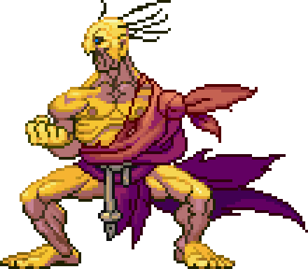
Frankly I think 1 and 2 are the only real options when looking at "so think about what will feel different and what will look good as a statue."
I think 3 and 4 are too "crazy" or odd of a color to "look good"
with 3, you have an old blue man with the same color wrap as 1. And I think the color scheme play better with 1.
4 just looks like he fell asleep in the tanning bed. It might just be the background, but then his wrap seem to be too dark.
If the fell asleep, I need an EX snot bubble head.

Then I would say 1 is pretty close to the original. So for "feeling different", I would have to inch it out to 2.