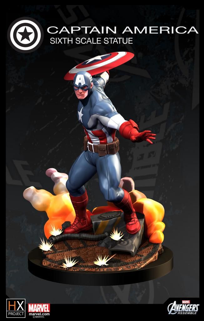
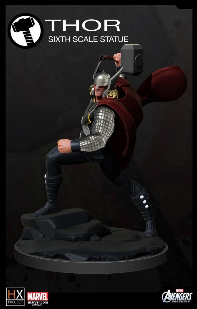
I really like how Cap came out, IMO the way he is stylized actually feels like modern comicbook artwork, I can totally visualize the HX Cap inside a comicbook today. The other characters though feel more like something from a cartoon show, maybe just a little too exaggerated imo. I know this line is meant to be toony, but modern comic style still fits really well for that purpose (think Hellboy for an extreme example) and I really hope the rest of the line stick to more of that Cap style rather than the TV cartoon look.
Just a quick comparison below, the Cap statue looks like he jumped right out of the comics, where as the Thor and Loki might be a little too stylized for that imo, I hope this image below is closer to what this line will eventually look like once we get the characters rolling, I'm personally looking forward to this line.
Also on another note, IMO keeping it industry standard at Bowen/Koto scale could help collectors get into the line easier, which is technically closer to 1/7 even though on paper it says 1/6. It's the little things that make or break the line, Koto started off as true 1/6 but eventually realized they are oversized and started producing in 1/7, better to get it right the first time.