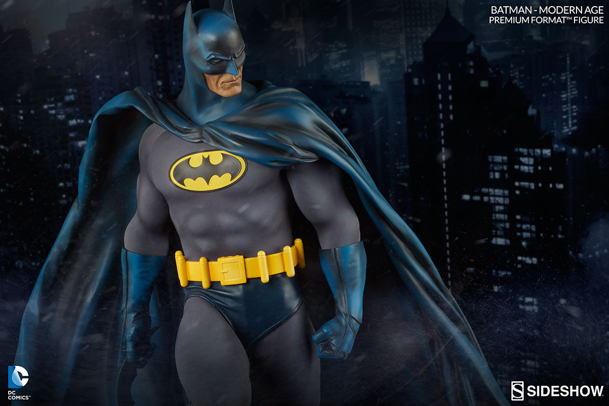
I just couldn't be happier with how this piece turned out. IMO they picked the absolute perfect shade of blue and I just love the painting/shading that goes from blue to grayish/black. It just makes his gloves, cape and cowl look so much more dynamic, especially in regards to the cape.
Original PF
 Modern PF

I really can't emphasize enough just how cool that shading from blue to greyish black really looks on this piece. Not to mention, I think the alternate portrait turned out much nicer with the Modern Batman:
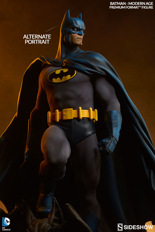

With the original PF, the alternate portrait makes him look like he is frowning, while the Modern alternate portrait is just a more serious, stern like look. Definitely prefer the alternate portrait on the Modern version better.
And again, while I was a bit worried about the Batman symbol, those worries have been 100% allieviated. I think the Batman symbol on his chect looks great.
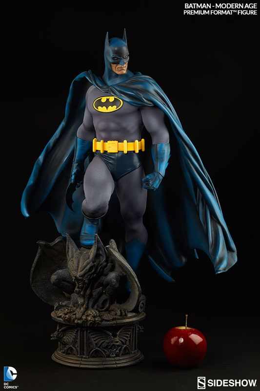
All in all, this is by far one of my favorite Batman statues produced to date.
A big

to Sideshow on this one!!!


