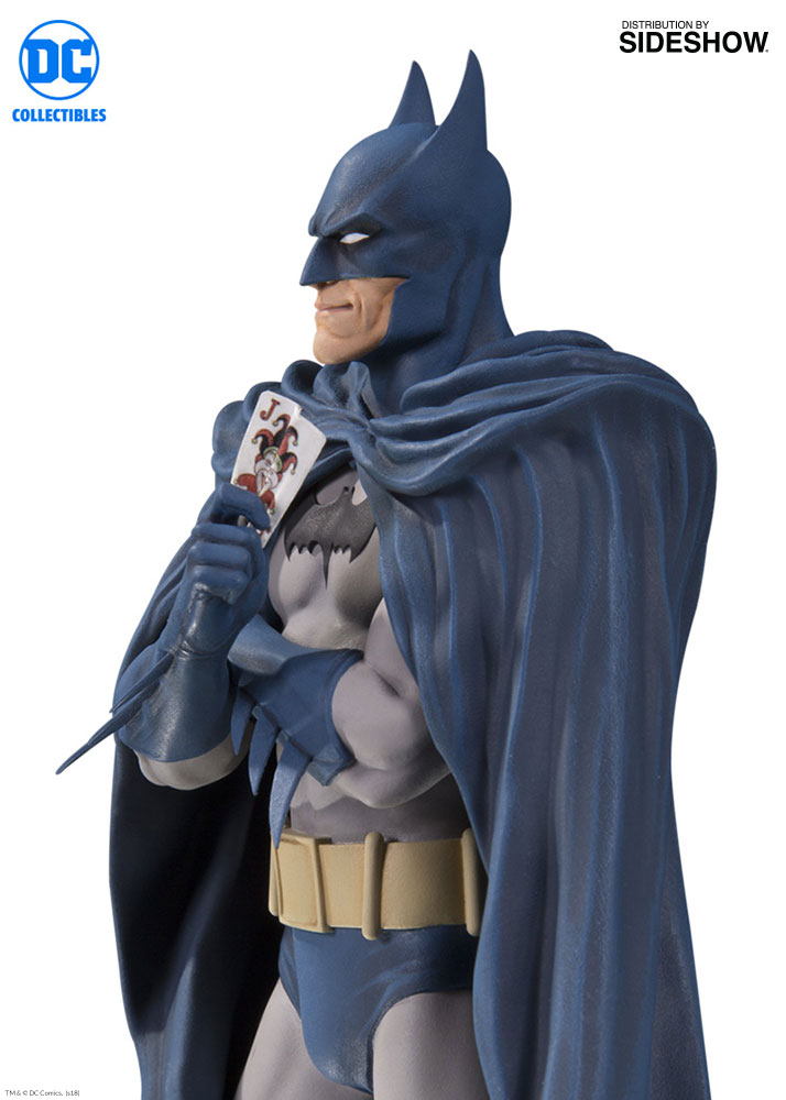
Not bothered by the cape. People understandably bring up McFarlane, but I felt Breyfogle's cape game was peerless.

I so badly wanted this to be an A+ entry, but it feels like a solid B to me. It's clearly marketed to those who grew up reading the oval Batman logo. An audience that crosses 3 decades minimum. So why the hell didn't they stay faithful to his capsule utility belt design?
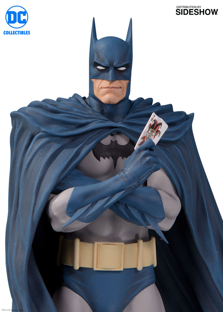
The paints may be the biggest disappointment. The blues just don't pop like they did in the teaser pic. They're too dull and the flesh tones are terrible. Too much gray overspray. Feels like a damp cloth is needed to wipe the dust off this statue that's been left out in the open.
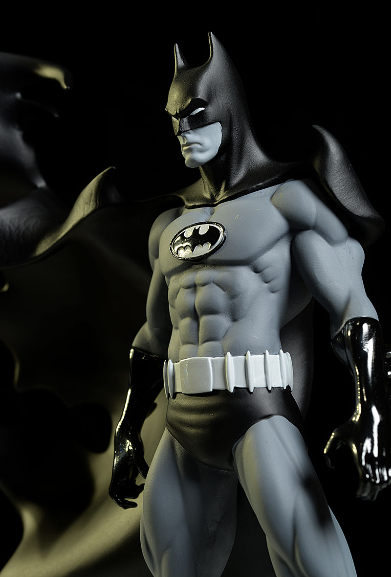
And the alternate portrait is flat out uninspired. Which I guess makes this a sad "wait on it" instead of the "must buy" I was hoping for. The regular portrait is fine, good even, but SS could've been so much more inspired with the EX. They could've done a truly comic style portrait like we see in the Batman Black & White series. Something like Jim Aparo, Norm Breyfogle, or Brian Bolland. The larger white eyes and a more angular jaw.
So overall I'm disappointed by what could've been. It's a fine statue and I'll likely wait for a deal.
 This pic credited to the awesome Michael Crawford reviews!