I love opportunities to put my editor's hat on... ask and ye shall receive!!
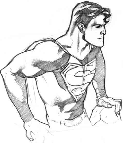
First - I'll try to comment on what I see so far - since this is not a comic page with story telling or even a full figure, I'll go on what's presented here. And I'm sure you're already aware, but when seeking opinions/feedback, try to include at least full body shots and even more importantly - storytelling art.
Anatomy: The good - from viewing just the upper torso, the proportions seem pretty good. No disproportionate appendages or missing features. The eyes look a little crooked (left eye is higher) and high up on the face - making for a long nose. (probably a style thing) but in general, facial proportions are important too. The musculature is good, but I can tell it's a little second referenced - as in taken from other artists work instead of the original (life drawings [best], wrestling mags, or body building mags). There seems to be a bit of insinuation of the musculature (I.E., shoulder, forearm, neck, rib cage). The biggest issue I see here depicts the shoulder muscles completely separated from the chest instead of being interwoven into the chest muscle - see below:
The abs (especially the serratus anterior) seem a little off and the external oblique should pop over the hips (think mushroom top) -see below:
The hand is incomplete and a little squished. It also seems to indicate a general uncomfortable-ness about it. The wrist bone should only pop out on the outer portion of the wrist - not the inner. The neck is a little off. The sternocleidomastoid muscle is a tad large. It should taper off as it gets closer to the chest not get larger... (see below)
But these are all minor things that some life drawing should be able to fix. All of the musculature stuff in my editor's brain - indicates to me that the art was second referenced from other already referenced images... which is what a lot of people do. But the problem with that is that they probably did the same themselves so you're starting from an already exaggerated representation of the human body. I understand that drawing from a comic book is about 1000 times more exciting that drawing your mom standing by a car... but you'll get perspective, proportions (car to person ratio), and posture, etc. Remember, comics is more than just superheros, it's about making the things they do seem impossible and you can only do that when you capture the regular guy staring at a superman lifting his car. I'm implying a great deal here because I'm basing this all off a drawing of an upper torso so take this all with a grain of salt.
Lastly - style. I am assuming that you want to draw comics so this feedback is based on that assumption. While this is nice looking rendering style, even if you plan on inking yourself, you have a slightly un-inkable rendering style. All of those tiny lines are going to close up and look a little splotchy (especially the face) when reduced 65% and colored. You have way to many stray lines. If you're lucky enough to get into the business, you're first inker isn't going to be Scott Williams or Dexter Vines... it's probably going to be Messy Kersplotchy who is suffering from a hangover along with a stomach virus from the sour goat cheese he ate last night. So as a newbie, you're going to want to be as tight and clean as you can to reduce the amount of "interpretation" done by your hungover 45 year old inker who's disgruntled that they couldn't make it as a penciller. The hair is good as far as shape, but should be drawn with much fewer lines (you shouldn't be drawing every single hair as it might take you days to finish a page where you have his head on it 9 times (times 22 pages). Think interpretive (see superman below).
I would recommend refining your rendering to something simpler and solid and/or less detailed/hatchy. You also have to remember, your inker isn't a mind reader and he/she is going to go over this with his/her interpretation of what he/she thinks you're trying to do.