Hard Hero's Namor (sculpted by Seth Vandable) statue literally explodes out to the marketplace looking markedly different than the two other Namor statues being offered by the competition. But in a crowded marketplace, does HH's version work? Is it worth starting yet another line of statues?
 Statue Concept
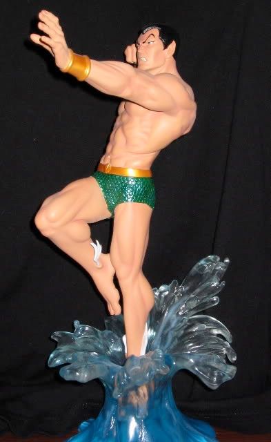
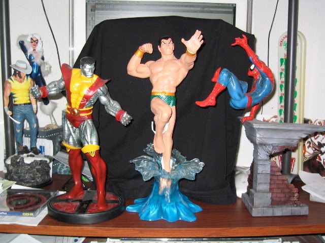
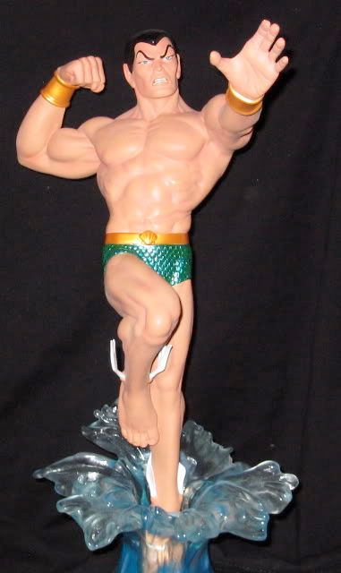
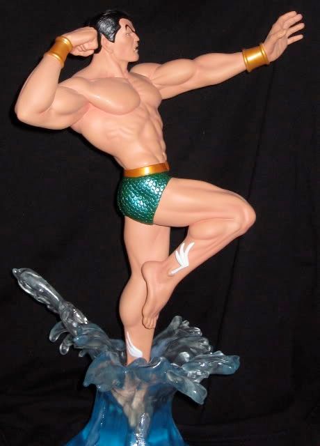
Like all of Hard Hero's Marvel releases so far, its Namor is definately set to at least try to impress the Silver Age crowd. There is nothing modern looking about this piece. However, while BD and DST tried to both imitate a popular Namor cover, HH tries to diffentiate itself by creating a nice action pose for the character. Namor is show leaping out of a nicely designed water base, set to punch the daylights at whatever enemy is coming at him (I'll always think its Iron Man). The scale, like all HH statues, is a 1/6 scale, so slighty but noticeabley larger than your average BD piece. As far as concept goes, while not traditional, its definately a bold, gutsy choice.
 The Sculpt
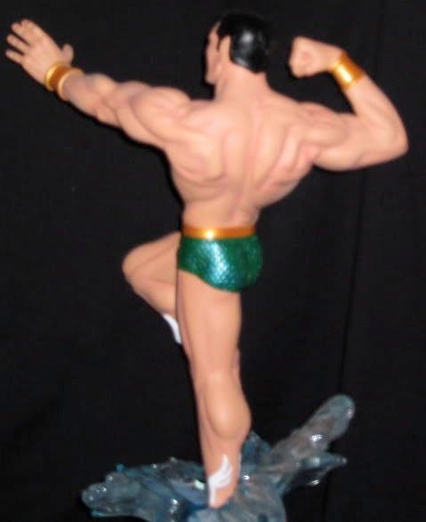
Like all of Seth's statues so far, the Namor has a very "comic booky" look to it. Shunning realism, Namor is exaggeratedly proportioned build wise. Muscules pop out everywhere along his back, stomach, chest and arms. But along with this, you'll find Namor has a noticeable belly button and even slight love handles on his obliques. You'll also notice his hands and feet may seem rather large (again, something you'll notice in all of Seth's HH work) even for its larger scale. Unfortnatley, Namor's outstreched hand is a bit akward, as two of the fingers are sculpted together instead of every finger apart. Namor's face is also well sculpted, looking appropriate pissed off enough to dive out of the water to punch someone's lights out. His trademark ears and eyebrows are also sculpted well.
The base is also very nice, and sets the piece off well. While many have complained about the bases for some of HH statues, Namor's is both elegantly simple yet appropriately complimenting of Seth's great sculpt. It does indeed strike a nice middle ground.
 Paint Job
Its hard to judge the paint job when Namor obviously has one of the simplest costumes in comic history. His green speedo and gold wrist guards are nicely painted. His hair and eyebrows are also nicely painted, as well as his wings on his feet. Other than that, he's all skin tone. Namor is niether to white nor too dark, which could have severely affeced the quality of the piece. As far as the base, the splash part of it is clear resin while the bottom part (representing the sea) is more aqua-green in color. Works nice. While the paint job didn't have to be one of the more complex ones, it at least works well.
 Over-all Value
Now this is where judging the Namor statue gets tricky. I honestly don't think HH's line is for everybody. Modern age fans may shy away from a line so dedicated to the silver age. Silver age fans may prefer the "safer" poses and more realistic proportions of Bowen Designs. Others may not like the scale, while some may not want to start at ground zero again on a statue line.
Having said that, I honestly think the HH Namor is one of the more eye-catching statues on the market right now. I also think HH has a nice look, a bold and energetic style that will appeal to a good segment of the market. And those new to the statue market will be thrilled at the prospect of a realistic chance to be a completist of an existing line.
Conclusion
As said before, this statue is probably not for everyone. Some may very well be turned off by the less realistic style HH is aiming for. However, HH's stylistic approach really works well on this statue. Since it has a great action pose different from BD and DST, has a great base concept, and with no major flaws to speak of, I give this statue a
four out of five star rating. Its just a very nice addition to my statue collection.