
|
 |
|
 |
 |
|
 06-23-2015, 02:41 PM
|
#31
|
|
Producer
Producer
Join Date: Apr 2014
Posts: 512
|
Sorry to hear you received prints without the caps. They were definitely not packed that way.
Also, we just realized there was a an error on the backend which caused people to receive regular instead of the artist signed editions. We were actually preparing to send out the artist signed editions today for free due to this error.
However, we are halting any more prints from being sent out. We are going back to the printers and reprinting every single one. We sincerely apologize for the quality not being what most of you had expected. This is our first release of prints and we only hope to send out the best that we can provide. We have heard your feedback and we are taking action.
|

|

|
|
06-23-2015, 03:59 PM
|
#32
|
|
The quickest way to double your money is to fold it in half and put it back in your pocket.
Join Date: Oct 2012
Posts: 1,433
|
Quote:
Originally Posted by Valkyrie

I echo everything you said here. No where near Sideshow's print quality. How was the packaging on yours? The tube mine came in did not even have caps on them! Not sure if they were removed on route or they were shipped that way. Also, no ArtGerm sig either. I'll be contacting them soon.
|
Both caps came on mine, but they were brittle and broken - I don't know how they stayed attached to the tube since there was no tape on them. Also, in closer inspection, I do see one crease on mine, so maybe these were opened and inspected by the post office at some point?
If anything, the black tube they're sent in is nice looking, and I wish Kinetiquettes would have double packed the prints so that all the stickers and shipping labels would be stuck to an outer box/tube so we could have the black one in nice condition (let alone the extra safety in shipping it would provide).
Quote:
Originally Posted by Kinetiquettes
Sorry to hear you received prints without the caps. They were definitely not packed that way.
Also, we just realized there was a an error on the backend which caused people to receive regular instead of the artist signed editions. We were actually preparing to send out the artist signed editions today for free due to this error.
However, we are halting any more prints from being sent out. We are going back to the printers and reprinting every single one. We sincerely apologize for the quality not being what most of you had expected. This is our first release of prints and we only hope to send out the best that we can provide. We have heard your feedback and we are taking action.
|
That's excellent news! These images are really nice, and doing some print samples to get the coloring just right would go a long way to making sure your prints are as good as Sideshow's, only except you'd have better characters to use instead of their in house Court of the Dead garbage ones 
|
|
|
|
|
06-23-2015, 04:23 PM
|
#33
|
|
Doctor Doom
Join Date: Sep 2013
Posts: 16,050
|
Thanks for commenting DiscoCougar. I hadn't ordered yet because I was apprehensive about the quality since they weren't using a giclee process and were using what sounds like regular paper.
Hopefully they will get the image sorted. Really wish these were on the Photo Rag® Bright White 310 gsm. cotton paper SS and Cook and Becker uses.
I will wait and see how the 2nd attempt fares and if it goes well I will definitely order both. I would like a collection of nice Street Fighter prints.
|
|
|
|
|
06-23-2015, 06:37 PM
|
#34
|
|
The Stones, I love the Stones. I watch them whenever I can. Fred, Barney...
Join Date: Nov 2014
Posts: 3,120
|
Quote:
Originally Posted by DiscoCougar
Both caps came on mine, but they were brittle and broken - I don't know how they stayed attached to the tube since there was no tape on them. Also, in closer inspection, I do see one crease on mine, so maybe these were opened and inspected by the post office at some point?
If anything, the black tube they're sent in is nice looking, and I wish Kinetiquettes would have double packed the prints so that all the stickers and shipping labels would be stuck to an outer box/tube so we could have the black one in nice condition (let alone the extra safety in shipping it would provide).
|
Thanks for getting back to me. At least you had something resembling caps on yours. 
If the caps were as brittle as you say, mine probably completely broke off in transit. Either that or I assume it was FedEx or customs tampering with the tube. The only thing protecting the prints from being completely destroyed was the thin plastic sleeve they were in and what was left of the tube.
I think the prints should have been packed individually too. One tube is fine but only use one plastic sleeve per print. Both of mine were tucked in one plastic sleeve together with nothing dividing them. Also, bubble wrap padding on each end of the tube like SS does (maybe that was already there but got lost on mine with the caps).
I do agree the design on the tube was pretty nice though. 
|
|
|
|
|
07-07-2015, 12:01 AM
|
#35
|
|
Producer
Producer
Join Date: Apr 2014
Posts: 512
|
Hi all,
Just to give an update. We are taking matters into our own hands and not outsourcing our printing. We just ordered our very own high end Canon Lucia EX printer and we are going to be doing giclee prints ourselves on museum quality 310gsm fine art paper.
We have shortlisted 3 types of fine art papers from the Canson Infinity line:
Rag Photographique: https://www.youtube.com/watch?v=runtSfUkvPY
Edition Etching Rag: https://www.youtube.com/watch?v=4InQay4s4hA
Platine Fibre Rag: https://www.youtube.com/watch?v=tk7D9i45Vcc
We will be doing some test prints next week and see which paper give the best results.
Last edited by Kinetiquettes; 07-07-2015 at 01:17 AM.
|
|
|
|
|
07-07-2015, 12:50 AM
|
#36
|
|
The quickest way to double your money is to fold it in half and put it back in your pocket.
Join Date: Oct 2012
Posts: 1,433
|
That's awesome news!
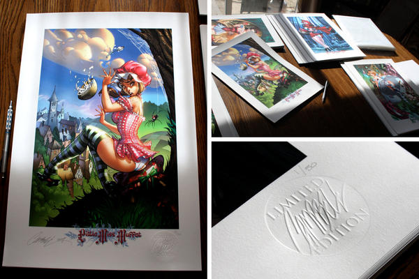
If I can make a suggestion, use J Scott Campbell's print template. Create a bigger white border around the image, use a bigger embossing seal for your company logo, and stamp each print in the lower corner that only fits in the white border. Then play around with the Capcom logo, print names, and edition numbers. Having "1/50" dead center under the print makes no sense. Put the numbers next to your seal, put the Capcom logo on the left side, and put the name of the print in the center. And make sure to decrease the font size of the copyright information on the right side, cuz it's ugly and doesn't need to be that large imo. Even better, make the copyright text super tiny and riding up the side of the print long ways.
For the prints you've released so far, you can only kinda see the 'K' seal on the Juri print since the colors are bright, while the Doll print is so dark that you have to look really hard to see it.
JSC's:
Yours:
(sorry for lousy camera phone)


|
|
|
|
|
07-07-2015, 01:16 AM
|
#37
|
|
Producer
Producer
Join Date: Apr 2014
Posts: 512
|
Quote:
Originally Posted by DiscoCougar
That's awesome news!
If I can make a suggestion, use J Scott Campbell's print template. Create a bigger white border around the image, use a bigger embossing seal for your company logo, and stamp each print in the lower corner that only fits in the white border. Then play around with the Capcom logo, print names, and edition numbers. Having "1/50" dead center under the print makes no sense. Put the numbers next to your seal, put the Capcom logo on the left side, and put the name of the print in the center. And make sure to decrease the font size of the copyright information on the right side, cuz it's ugly and doesn't need to be that large imo. Even better, make the copyright text super tiny and riding up the side of the print long ways.
For the prints you've released so far, you can only kinda see the 'K' seal on the Juri print since the colors are bright, while the Doll print is so dark that you have to look really hard to see it.
|
Thanks for the suggestions. We are actually looking to do exactly that. We are moving the Seal down to a wider white boarder and also reducing the size of the copyright text. Also, we are shifting Capcom logo and copyright text to the edge of the paper instead of being at the edge of the print area, because some people prefer a clean white border when they frame up the print. Which is why we might not be putting the title of the print.
|
|
|
|
|
07-07-2015, 07:28 PM
|
#38
|
|
I was trying to daydream, but my mind kept wandering.
Join Date: Oct 2009
Location: SF Bay Area
Posts: 2,684
|
^Good stuff!
|
|
|
|
|
07-08-2015, 12:40 AM
|
#39
|
|
Doctor Doom
Join Date: Sep 2013
Posts: 16,050
|
Quote:
Originally Posted by Kinetiquettes
|
So glad it's going to be cotton. Can't wait to hear which looks best.

|
|
|
|
|
07-11-2015, 01:24 PM
|
#40
|
|
Kindly Asked To Leave
Join Date: May 2012
Location: Farmington Hills, MI & La Fortuna, Costa Rica
Posts: 4,525
|
Quote:
Originally Posted by Kinetiquettes
Thanks for the suggestions. We are actually looking to do exactly that. We are moving the Seal down to a wider white boarder and also reducing the size of the copyright text. Also, we are shifting Capcom logo and copyright text to the edge of the paper instead of being at the edge of the print area, because some people prefer a clean white border when they frame up the print. Which is why we might not be putting the title of the print.
|
A white border is as must, but in my opinion, excessively large white borders only take away from the size of the artwork itself and thus take away from the quality of the print itself. Anything over 1" to 1.5" is excessive. And if your going to use a seal, please make it a small one. Like the large white borders, really large seals only take away from the artwork itself.
I have been collecting prints for close to 20 years and my favorites have always been the companies that kept it clean and simple and let the artwork speak for Itself. The prints that Aspen comics produces are a perfect example. While I have not agreed with all of the reprints they have produced in recent years, the overall design of their prints is 2nd to none.
Here is an example of Aspen's prints.
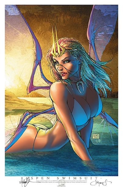
Aspen has produced well over 750+ prints in the last 10 years and each and every one of them have been identical style wise. The only exceptions are the Marvel and DC prints Aspen produced as those don't have titles or words at the bottom, just a tiny DC/Marvel copyright line that is barely viable. Both styles (with or without the title and artist information) are amazing. In my opinion, its the best design on the comic market. Its clean and simple and it really does let the artwork speak for itself. I am really hoping you guys settle into a similar design.
Here is an example of Aspen's DC/Marvel prints without the title and artist info.

I am a bit curious why you decided to go with Canon over Epson? And in regards to testing, you shouldn't feel like you have to stay with Canon for the paper. There are some absolutely stunning fine art paper's out there that are not Canon/Epson and many of them get overlooked simply due to the fact that a lot of artists/companies tend to choose the brand of paper based on the brand of printer and inks. Its perfectly fine to do so, but again, you ultimately overlook a lot of amazing and unique fine art papers out there by going that route. Personally, I keep hoping for a company like your's to get really bold and release a few prints here and there on various handmade Washi papers for digital printers. I have used some of those papers myself (i'm a professional photographer) and some of them are absolutely breathtaking and can completely transform your image. Anyways, just something to think about if you don't get the quality your looking for from the Canon papers you test.
|
|
|
|
|
|
 Posting Rules
|
You may not post new threads
You may not post replies
You may not post attachments
You may not edit your posts
HTML code is Off
|
|
|
|
All times are GMT -4. The time now is 01:38 PM.
|


