Quote:
Originally Posted by NorthernLadMSP

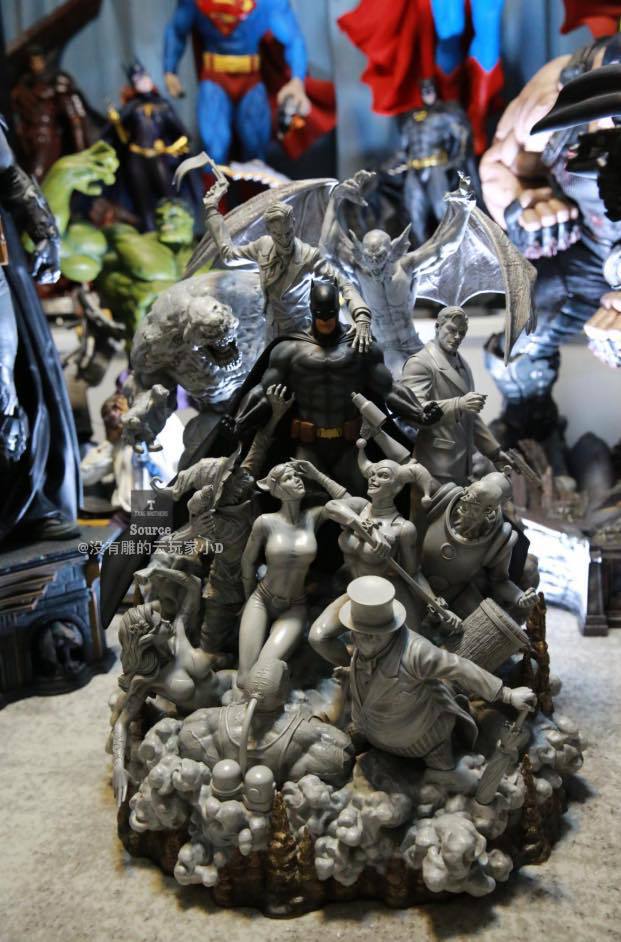
Agreed. It looks like they painted Batman and forgot the rest. I think the fully painted version looks much better.
|
Exact opposite for me.
The multi-colored painted version gives me the impression of a toy display.
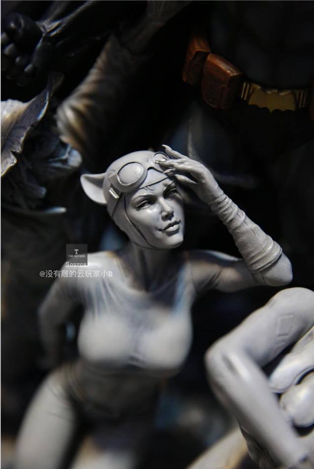
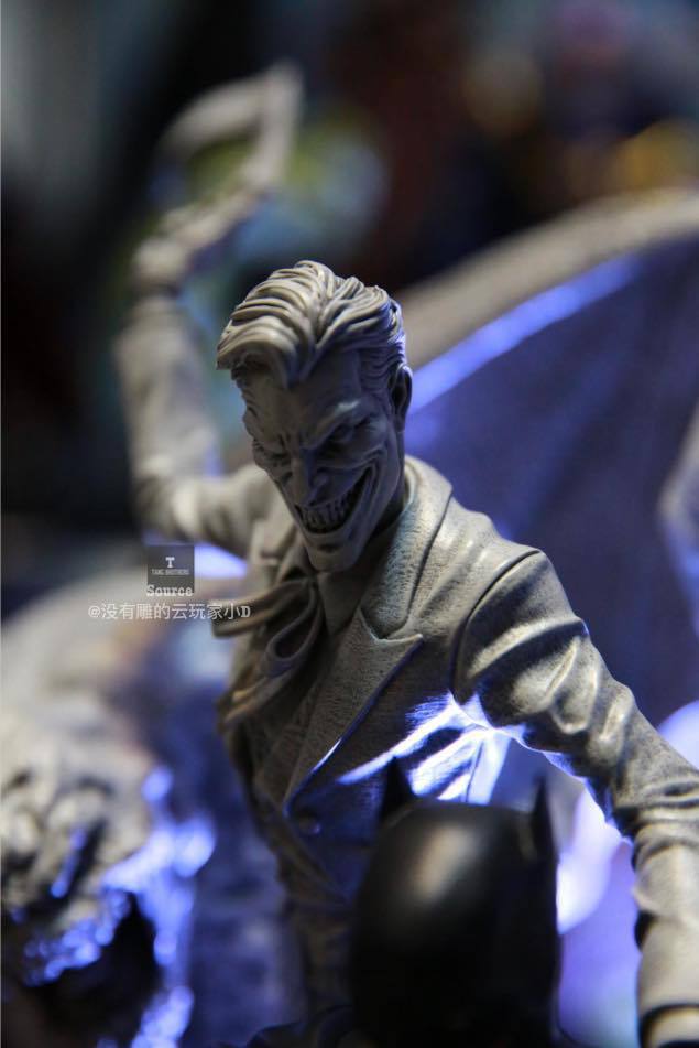
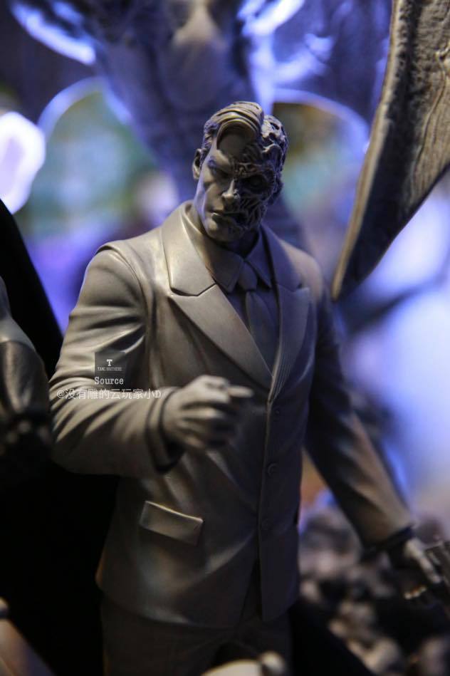
I see the B&W version as conveying a more unified idea, in a more low-key, sophisticated way, with the full colored Batman fig in the center maintaining the primary focus through contrast by both aesthetics (the difference in full color) as well as narrative representation (good v evil, true v false, real v fantasy).
I was wondering if they might go in further to punch up certain values in the grayscale of the rogues and smoke, like giving the clouds a slightly darker grey to give those elements more visual interest by themselves.
Then I realized a range of values would imply more solidity which is at odds with what the whole intent of the uncolored design is.
Less solidity conveys the insubstantial vagaries of a dreamworld. A simple line wash on everything is as far as it should go. Certain forms and details within that melange shouldn't carry any more weight than any others. They should all blend into one big nightmarish idea.
It's not laziness or cost-cutting. They made the right call editorially, IMO.
As a basic object d'art, I would also choose this one over the colored version as it's more unified in (color) tones and would blend in better to decor outside of dedicated statue/toy room.
For that reason, along with the idea that some people may feel like they are getting gypped by paying for something that's "mostly not even painted", I'm sure this will be the much less popular of the two.